
We get questions about the look of full-width images on pages frequently, so we thought it made sense to create a resource to show clients if questions come up. It’s a widely used design technique, but when you take into account the multitude of device sizes, clients can be confused why the image on the live site might look different than a PSD mockup or what they might have envisioned.
Simply put, it all has to do with ratios. In this article we’ll explain with some visual examples.
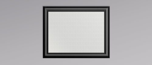
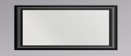
Let’s take an object everyone knows, a picture frame. Below are two frames, both landscape, but one wider than the other, but both the same height – these represent different browser widths.
Now we’ll take this image, which we’ll want to display in an area on your website with a fixed height (the 2 different picture frames).

This first example is taking this landscape picture and containing it to a frame that’s not as landscape, a different ratio. This would happen on a tablet-sized screen with the height set the same as it is on a desktop computer. Website visitors who don’t have their browser at the full width of their screen can also see it this way.
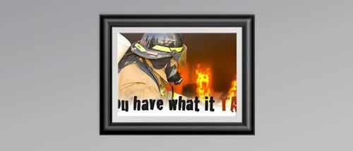
As the screen gets wider or the frame is shorter in height, the top and bottom of the photo will start to get cropped, in this case, cutting the text at the bottom.
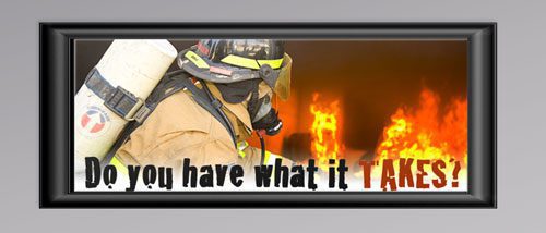
Here’s the same picture that’s filling the container (the frame), but with a browser that’s wider – whether that’s a visitor to your site that has their browser to the full width of their screen, a large tablet that’s in landscape mode, etc.
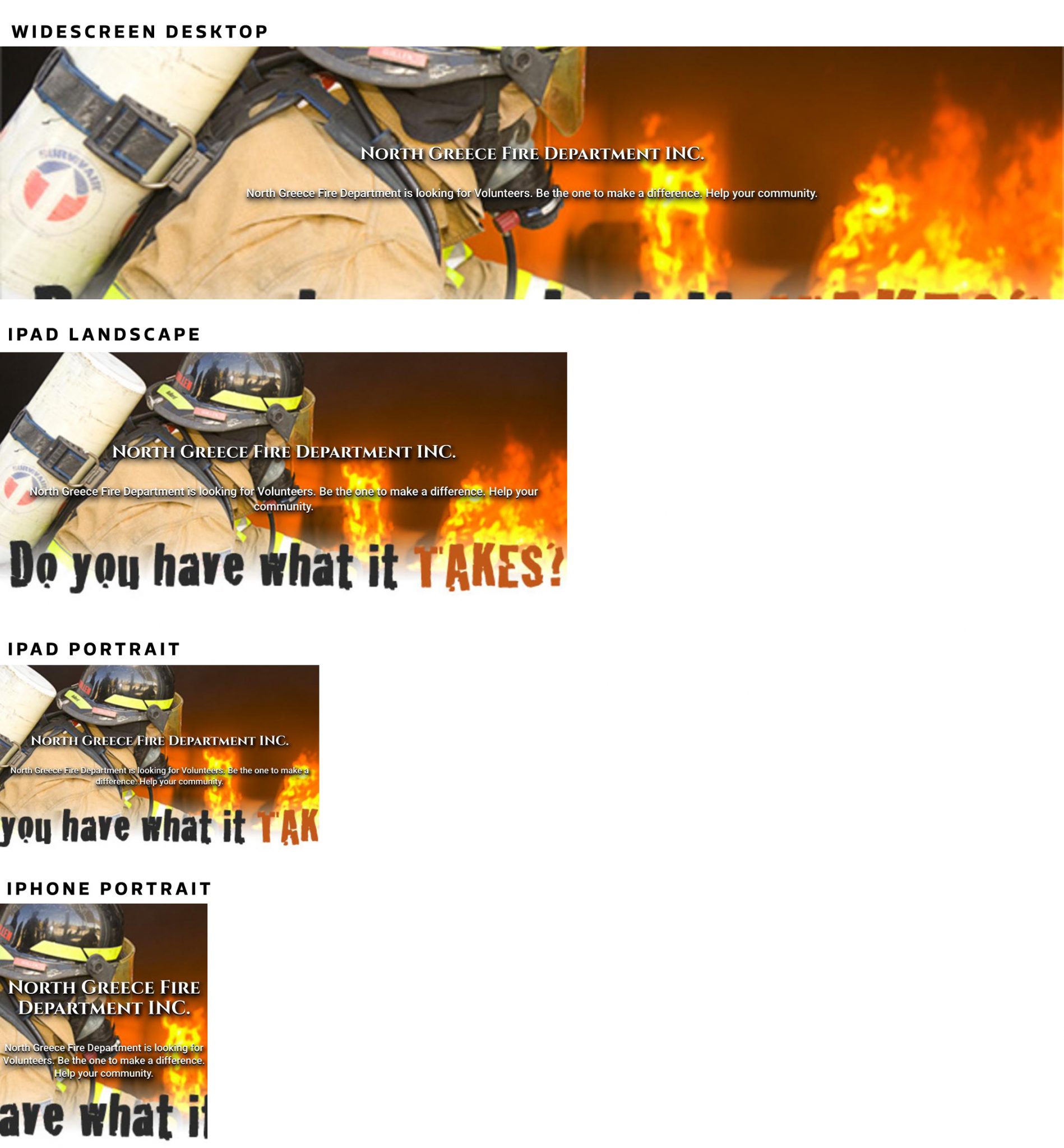
Here is a real life example on the North Greece Fire Department website. The header image which we’ve used in the examples above are is shown at different screen widths. You should notice two things. The fireman and the flames can be seen in some fashion at all screen widths. And the text that’s written on top of the image (not the text that’s embedded in the image) can be adjusted to fit the space, whereas the embedded text cannot rearrange.
Now, you might be wondering, why not adjust the height as necessary to keep the ratio? This CAN be done, however, you run into other issues. If you have a carousel / slider of images, to have the slides all take up the same amount of space, each image would have to be the same exact pixel size (height and width), or you’ll notice the slider adjusting height up or down when going to each slide. This isn’t great for user experience, and for an administrator of a website, it’s a pain to ensure all images you’re uploading are exactly the same in pixel size. This is exactly the reason why we at Nevis Technology choose to create a canvas with a set height, and insert the image within that canvas – cropping the width or height of the image as necessary. It’s very lightweight in terms of strain on the browser, which creates a faster and better user experience. It also is good for the administrator because they don’t have to worry about opening Photoshop and making images the same size, or asking a designer or their web developer to do it – this results in a faster turn around to getting the page up.
It’s also a good method to use because you’ll be more in control of where the image is to “the fold” of your site. Though, we really debate if “above the fold” is still a topic because of the wide variety in screen sizes and pixel densities, some clients still talk about it and it’s important to them. If you’ve never heard this expression, it started with newspapers and having a story on the top half of the front page, above the fold of the newspaper, where it’s very visible. In web development, it’s the same idea – keeping the most important information easily viewable for a visitor to your site since it’s been proven people have a short attention span. What we’re debating is, where is the fold? In the old days when everyone was on comparable desktop computers, it was pretty easy to estimate, but with the introduction of smartphones, tablets, phablets (large smartphones) – all of which come in a variety of sizes, how do you determine where the “fold” is without testing and making changes for each device? That would be like developing many sites-worth of work, making device-specific adjustments, and it’s just not reasonable.
Not to say this is the only way to display full-width images or use images in sliders, but this is a pretty standard way that we produce, and you’ll see this method in a majority (if not all) of the major slider/slideshow/carousel plugins.
Takeaways
- Don’t use images with text embedded
- Use images that have enough empty space between the edge of the picture and the content within the picture that you want to prevent cropping
- Loosen up! People are used to viewing images on sites like this. It won’t look silly as long as the bulk of the image – the important part – is still mostly visible
- Designers and some owners of websites get uptight about how the live website looks versus the mock up, but here’s a secret; One thing we’ve always expressed is no one knows what your site is “supposed” to look like! As long as it looks good, it’s fast, and they are able to find what they are looking for, it doesn’t really matter to get all caught up in comparing the site to what a designer mocked up. That’s just one “snapshot” of the site on a fixed-size canvas. It’s not a reliable way to expect a site to look – again, with all of the device widths, heights, pixel density, etc.
If this seems confusing or overwhelming, don’t worry! We’re here to help guide our clients through this process, making it as easy as possible.