10/14/2015
Nevis Technology is excited about the Client Center product that we’ve been developing for Financial Symmetry. The project started this summer with some general ideas, so we got started on the design aspect of the site first. Financial Symmetry is a financial advisory firm, so we needed the look to be professional. We also needed the usage of the site to be clean and easy to use, as a lot of their clients are baby boomers. The experience of the Client Center on tablets and mobile devices was a strong requirement – as is for most sites these days – but we needed to ensure spotting the information was easy, uncluttered, and easy to interact with.
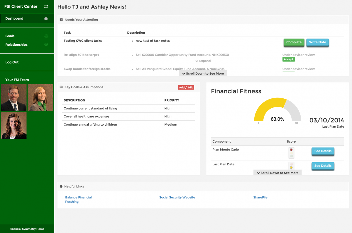
We chose some simple conventions that clients would pick up on without instruction, such as red / yellow / green colors. The initial color structure has evolved a few times after receiving feedback to make sure it’s as clear as possible, and then came the even more apparent, stop light indicator.
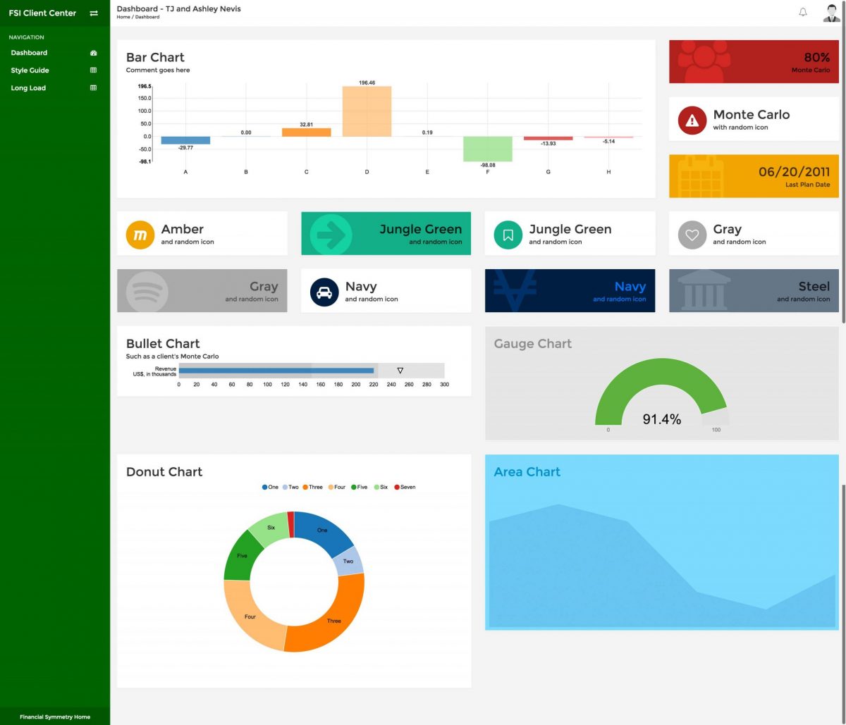
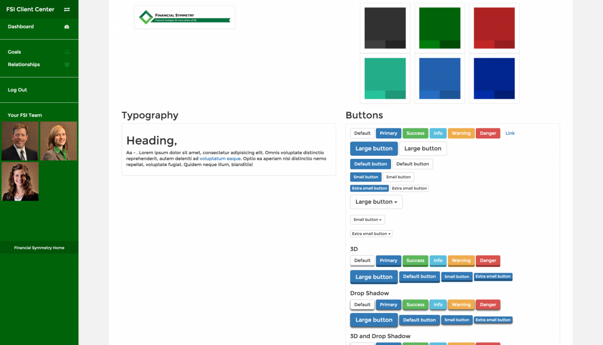
The initial design of the project lead us to create reusable widgets, colors, and a variation of styles, and charts. We created a style guide to display in one place, the colors, button variations, bullet lists, tables styles, etc.
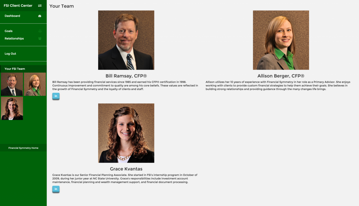
The Client Center has transformed from a proof of concept to a product almost ready to launch. We’ve been connecting with actual data in their database, as well as pulling data from their website – such as the Your FSI Team section. The images, text, and LinkedIn links of the FSI team are pulling from their WordPress site, so maintenance is not a headache. As pictures or bio’s of the team changes, this site updates automatically.
Stay tuned for our continuing updates on this post!


1 Comment.
[…] You can read more about this project over at this Nevis Technology blog post. […]